How To Get Colors Right In Fashion Ecommerce Imagery
High-quality product photos are an important part of putting your online fashion retail business at the top.
Published byLooklet/July 1, 2021
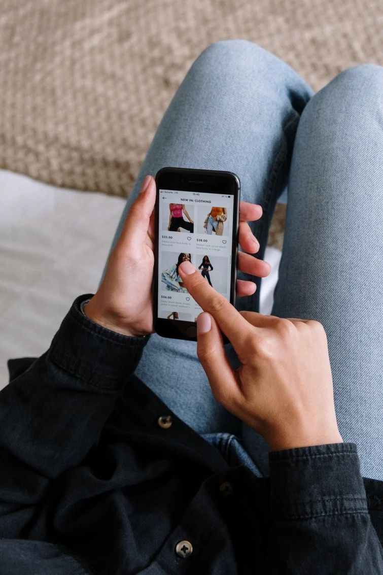



For an online fashion retailer or brand, showcasing your ecommerce products with high-quality images can be the winning difference between a conversion and no sale at all. An eye-catching photo on a product page can be the determining factor for a customer when deciding whether to purchase a product or abandon their cart. And more importantly even, it is a key factor to reduce return rates, especially of fashion products.
Getting the color right is an important part of producing high-quality ecommerce images, and something that should not be overlooked. At Looklet, we sometimes receive photos of garments shot from an iPhone and on a hanger in a warehouse and get asked why the color in our images doesn’t look the same. They actually shouldn’t, but we’ll get into that a bit later.
For example, we received the left “blue” dress, combined with the question why the color in our image looked purple (center image). We asked the studio manager to send us the physical garment for an analysis. As it turns out, the garment is purple, we saw that already while unboxing (right image). We also found the dress on another retailer’s website, also in purple (although we can’t know if they applied extensive recoloring to their images).
So why were we not on the same page? Several of the 7 common traps when assessing color accuracy in ecommerce photography were in place, most notably different cameras and different environmental light.
Great e-commerce product photography requires very little in terms of equipment, but the quality of the equipment is important. For the Looklet Studio we use a Canon DS5 — the best camera for fashion photography. The high resolution sensor produces some of the most detailed and high quality images, especially when coupled with Canon’s tilt-shift lenses.
While there are many photographers that advocate for natural light, there’s no doubt that good studio lights give you far greater control over your images. E-commerce photography typically features clean white backgrounds with bright, well lit products, which can easily be done in a small studio using just a few studio lights.
Consider the position of your light: The height, angle and distance from the background all have an impact on the result. At Looklet, we control each light and flash through our computers and ensure consistency across multiple Looklet sets so that your colors look accurate regardless of where you shot your garment. As a side benefit, this should eliminate any post production needs for color correction on your side.
Check for flare: Flare can make your subject appear flat and washed out, which you want to avoid.
Consider backgrounds and shadows: Backgrounds are another customization option available to you when completing your outfit images in the Look Creator. When setting up your Looklet account we have over 50 standard backgrounds available to you that can be added for you at no extra cost – from variations in standard whites as well as a number of bright colors. Depending on your needs, we can also create tailored ones for you as well as bespoke, dynamic model shadows.

How to compare the color of fashion images
If you’re an online fashion retailer and would like to compare the color of two fashion ecommerce images you want to follow the following four key steps.
Look at both images on the same screen: Look at both images on the same screen or two calibrated screens, using the same image viewer.
Check they’ve been shot the same: Make sure both images are shot using the same camera and in the same color space.
Check for consistent light: Check for a consistent light setup in both images, including direction of light, intensity of flash, and temperature of the light.
Use a grey background: If you have to rely on your own judgment rather than using color measurement tools, have similar (ideally neutral grey) backgrounds to minimize optical illusions.

A simple but good way of comparing and verifying colors and getting a clear understanding of color in an online environment is to do a test where you browse your e-com site on a few different screens at the same time and compare the color representation.
Ideally, the screens should represent the screens of at least 80% of the online customers. This usually contains 1 or 2 mobile devices and a few basic off the shelf PC screens or laptops. If the physical samples of the selection of products compared can be used as reference it’s even better. But in that case, make sure you have both a standard indoor light (warmer) as well as daylight (cooler) to view the product.
To set this up at scale in e-com imagery, you need deep color knowledge, a retouch team on site, extensive tooling, and time and money. Alternatively, you can trust in an established turnkey process like Looklet, with proven color accuracy levels above industry standards.
How can the Looklet Studio help me?
Using the Looklet Studio, retailers can shoot up to 100 items per day with only 1-2 studio operators needed. Create your looks in just 1-2 minutes via our Look Creator software, with 65+ pre-shot real models (digitised and ready for use any time). We process your images and return them back to you when they’re ready to publish online. Images are ready overnight.
Learn more about how Looklet ensures color accuracy at scale here.
Discover how our AI powered e-commerce solution combines the best of both worlds: real and AI generated models, along with advanced virtual dressing room technology to enhance your digital dressing experience. If you’re interested in learning more about how we can support your brand, feel free to reach out to us through the ‘Contact Us’ form at the bottom of this page!
Why AI Video Is Powering GEO – and What Fashion Retailers Need to Do About It
Read the full blog post
Dynamic, Flexible and On-Demand Digital Dressing
Read the full blog post
How Tech can help Fashion Retailers overcome rising costs
Read the full blog post
 AI-generated Fashion Model Images: Data-driven & Personalized